Canon's been churning out crazy SLR's on the low end ever since their introduction of the original Rebel back in the 1980's. Sort of the Sony of the camera biz, Canon always seems to find a way to pack high-end features into cheap bodies that almost anyone can afford.
I owned a Rebel 2000 for this reason, and have been waiting patiently ever since for Canon to release a DSLR with all the features that I wanted for under $1,000. That camera is the Rebel XT.
8 megapixels, true RAW+JPG support, DIGIC II processor, 35 zone metering, custom functions, bulb mode, independently selectable color space, non-crippled firmware (vs. its older brother), I mean everything an amateur shooter could want is in there, with none of the issues the original Digital Rebel had. I knew I had to have one.
I've now owned my Rebel XT for around three months, so you can consider this sort of a long-term test report versus an actual review. I'd recommend reading through the
excellent writeup at DPReview for the all-important initial review and formal testing - it's very thorough and informative, as DPR always is. But as is usually the case, various issues - both good and bad - will make themselves apparent over time as opposed to on initial testing. So hopefully you can glean some useful info out of this report as well. (Feel free to ask further questions in the comments section - I will respond there.)
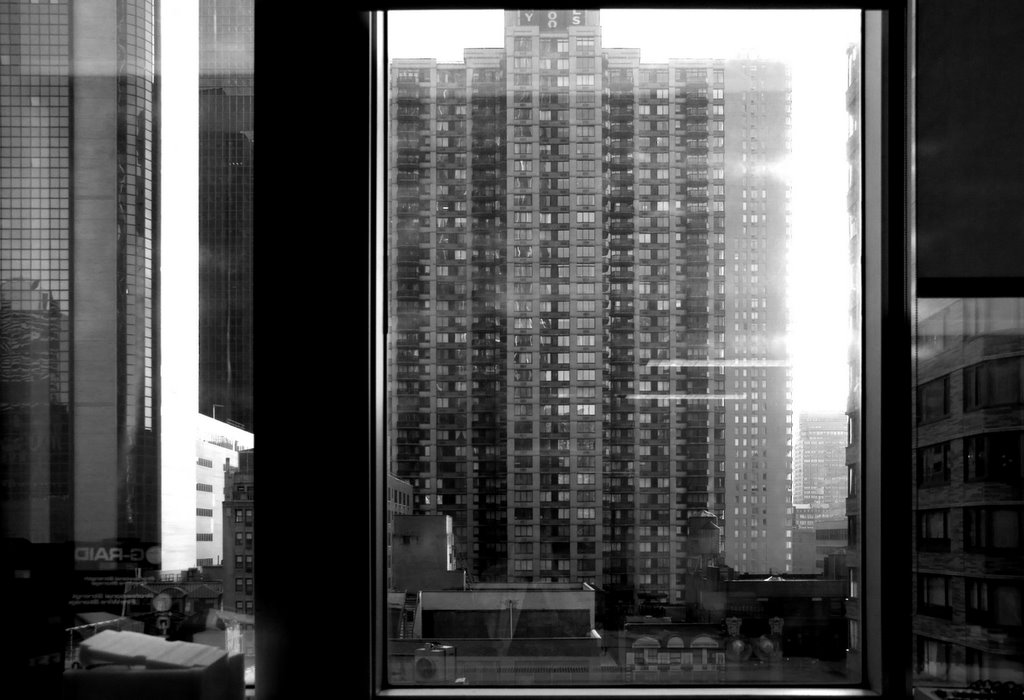
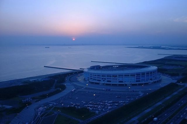
First, here are a couple sample photos I've taken so far with my Rebel XT (extra compression courtesy of Flickr - the originals are clean):


You can check out more as I post them at my photo blog site Doubleperf. Overall, I find the image quality to be excellent, with extremely low noise, very good dynamic range (though not quite equal to film), and no visible artifacts of any kind in either RAW or jpg modes.
I recommend doing a real camera test after buying any new camera body - don't just start shooting with it, do some more rigorous testing to make sure both that your camera is not defective in any way, and that its performance is satisfactory to you (building cameras and lenses is not an exact science, and no two are ever exactly alike). The first two things I did with my XT were the hot pixel test and the focus test. The camera passed the focus test with flying colors - you can see the results here. If you'd like to run this test yourself, you can download the instructions and the form to print out here. Nevermind that it says it's for the Nikon D70 - it will work with any camera.
The results of my hot pixel test were more interesting. Hot pixels are a point of contention in the digital camera world, but the bottom line is every camera has at least a few. Every single one, whether you see them or not. This does not mean all cameras are created equally - compare DPR's 30 second exposure test of the Rebel XT vs. the same shot taken with the Olympus E-300. (You'll probably need to refresh your browser after clicking those links.) Yet even in the Rebel XT test, in which review Phil Askey says he sees "no evidence" of hot pixels, I count at least three in the sky alone, with probably more masked by the ground lights.
What is a hot pixel? It is simply a transistor on the camera sensor that gets overcharged when exposed to light for longer than normal periods of time. There are also "stuck" pixels (which are usually a bigger problem), which will be the same color in your photos no matter what. With 8 million tiny transistors in the Rebel XT's sensor, you would have to be exceedingly lucky not to have a few performing slightly out of spec. But the fact is in almost all cases they should not be noticeable, and in cases where they are (such as long exposures), noise reduction will usually take care of them.
It is possible to have what some might consider an excessive number of hot pixels, however; or you may have hot pixels that are visible nearly all the time. This would probably be unacceptable to most photographers. The way to test your camera for this is to take a 25 second exposure at the lowest possible ISO setting with the lens cap on. You'll get a black frame, free of sensor gain noise, and you'll pretty easily see any hot or stuck pixels.
In my case, shooting in jpg mode I saw only one, very faintly, but near the center of the frame. Its location was annoying, but I did some further real-world tests and it never showed up. In RAW mode, I originally saw about eight or so hot pixels, and the one near the center was brighter than the jpg version, but somehow the second time I connected up my camera these all started getting "mapped out". This was true of both Photoshop CS2 and Canon's own applications. I can see it happen, too - I'll see the hot pixels for a second, and then poof. They're gone. So clearly I do have around eight or so mis-behaving transistors, but in jpg mode the in-camera processor seems to kill all but one, and in RAW mode the RAW processors manage to get them all. (This is probably why the people that claim to have no hot pixels think that - I'm sure they do, they just never actually saw them.)
Now, in terms of actual operation, I'm quite pleased with the Rebel XT, but with a few caveats. It is small and light, yes - bordering on too small. My right hand "overhangs" the grip a bit, and there is so little space between the grip and the lens mount that I almost always scrape my fingernails against the mount. No big deal, you say, except that there's something about the finish of this camera that literally grinds fingernails down. It feels like an emory board. So by the end of a day of shooting, my camera body is almost always covered in this white fingernail dust. Not a deal-breaker, but annoying to have to constantly clean off.
The Rebel XT has all of the controls you would expect a decent SLR to have, and it feels pretty meaty for a camera in its price range. People do argue about whether one camera or another has better build quality, but the fact of the matter is all cheap DSLR's are made of various types of plastic and they will all break if you drop them from eye height onto concrete. So, don't do that. Otherwise, though, the Rebel XT has a satisfying metal mode dial that locks firmly into position, and an almost too-robust shift dial for selecting things like focus points and program shift. It offers a lot of resistance - maybe too much - but feels like it would be impossible to wear out. The camera itself is built on a metal frame, and it has a metal lens mount. It has a satisfying heft to it and while I've heard some say otherwise about their Rebel XT's, my particular camera has no flex at all. It feels well built.
The back-of-camera controls and displays are a bit of a mixed bag, but they're basically fine, with one major annoyance that becomes more pronounced the longer you use the camera. Because of the Rebel XT's size, the status LCD is located on the back of the camera rather than on the top, like most. For me, this is not ideal, as I find I look at this screen most often just prior to starting shooting, when the camera is more at waist-level. Canon obviously thought most people would look at this info with the camera at eye level. Maybe they're right, but I'm used to the way other cameras work.
The bigger issue, though, is that the ISO is not displayed on the status LCD. This is just stupidity. It's my one real gripe with the design of this camera - nothing else I've said is really a major issue, but this just boggles my mind. Even my seven year old Rebel 2000 had this. Even full manual cameras 50 years or older had a little dial where you'd set the ISO and be able to see it at all times. This is pocket-camera territory here - why would Canon think photographers would not want to see their selected ISO? Ok, it is true that you can hit the "ISO" button on the back of the camera and see it immediately, but even that design has a bit of an ergonomic faux-pas, as rather than simply showing you the ISO, it shows you the entire list of ISO's with a small arrow next to the one you've selected. This can be difficult to see in bright sunlight.
I've been tripped up by this a bunch of times. I shot an entire series of photos at the Hayden Planetarium here in NYC in bright daylight at ISO 800, for example, because I forgot that I'd set that for the interior museum shots I had taken and there was no obvious camera display to let me know. (This was really my fault, but it would not have happened had the display on the camera been better designed.) I just have not seen a serious camera in many years that does not display the ISO setting by default.
A lot has been made in various forums about the Rebel XT's menu system, specifically the fact that the ISO, white balance, metering and auto-focus controls are simply hot-links to menu items rather than dedicated buttons. Myself, I don't see the issue with this. For example, to change the ISO on most cameras you either repeatedly press a single dedicated button to get the ISO you want or you press a button and turn the mode dial. On the Rebel XT, you press the ISO button and then press either up or down to change the ISO. In the end, it's no more difficult to make the selection by the Rebel XT's method, so I have no problem with this. The rest of the menu system is Canon's standard menuing system that's carried over from their entire camera lineup, so no real surprises there.
Technically speaking, the Rebel XT has done everything I could have wanted it to do for the price I (really, my wife!) paid for it - its image quality is excellent, it's lightning-fast, it's extremely versatile, and the only function I've found myself missing at all is spot metering. (It does have partial metering, but this is not quite as good as spot.) But what about the intangibles? Photographers like to think about cameras as an extension of themselves - the trick is for the camera to act intuitively, in a way that the photographer simply expects. The camera should never get in the way of a good photo.
After three or so months, I honestly can't say I've completely "bonded" with this camera yet. It may still be simply the effects of getting used to a digital SLR, but I'm not sure. Neither digital photography nor SLR photography are new concepts to me, but putting both together is more of a challenge than it seems. The ISO (non) display issue continues to trip me up, I've yet to fix upon an AF/AE button combination that I feel comfortable with (this is selectable as a custom function), and I still fairly often find myself either fumbling with the camera's settings before taking a shot, or missing a shot because I had various settings wrong.
Now, DSLR's are inherently complex to the point that every one of them will always require a certain amount of practice and learning. So I'm not at all worried about this yet, but it's something for anyone new to or unfamiliar with the world of DSLR's to consider before buying. If you're afraid of a learning curve, or if you think you're the kind of person to simply leave the camera set on "auto" all the time, you may as well save some money and go with a prosumer model with a built-in lens.
Which brings me to my last point - the kit lens. I sold all of my old Canon lenses a while back, so I decided to start out with the kit lens when I went for the Rebel XT. I must say I've been pleasantly surprised at its quality. Used properly, it is a cheap, versatile lens that will give you sharp results. Here's a little informal test of sharpness I did with the kit lens, auto-focused and set on a tripod:

Pardon my dust and shallow depth of field, but that looks pretty good to me!
Of course, the Rebel XT will accept any EF or EF-S lens in Canon's lineup, so you've got a lot of choices. But there's nothing to complain about with the kit lens, especially given the $100 premium you're paying for it. That's not a lot for a decent lens.
Questions, comments, I'd be glad to hear them.


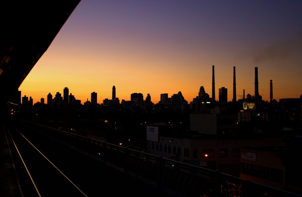
 The view from the bridge. I have a ton of these - I took similar pictures all the way across - but this one was as good as any, so I'm just posting one. Look at the line of lights along the edge of the coast of Manhattan - that's traffic on the FDR Drive that's backed up for miles. If you open this up and see the lights in the sky off in the distance, those are helicopters - most likely watching the Brooklyn Bridge foot traffic. If you're unfamiliar with NYC and wondering why there's no traffic on the street directly below me, that's Roosevelt Island - it's an enclosed island that basically just terminates in a dead-end at the end of that street.
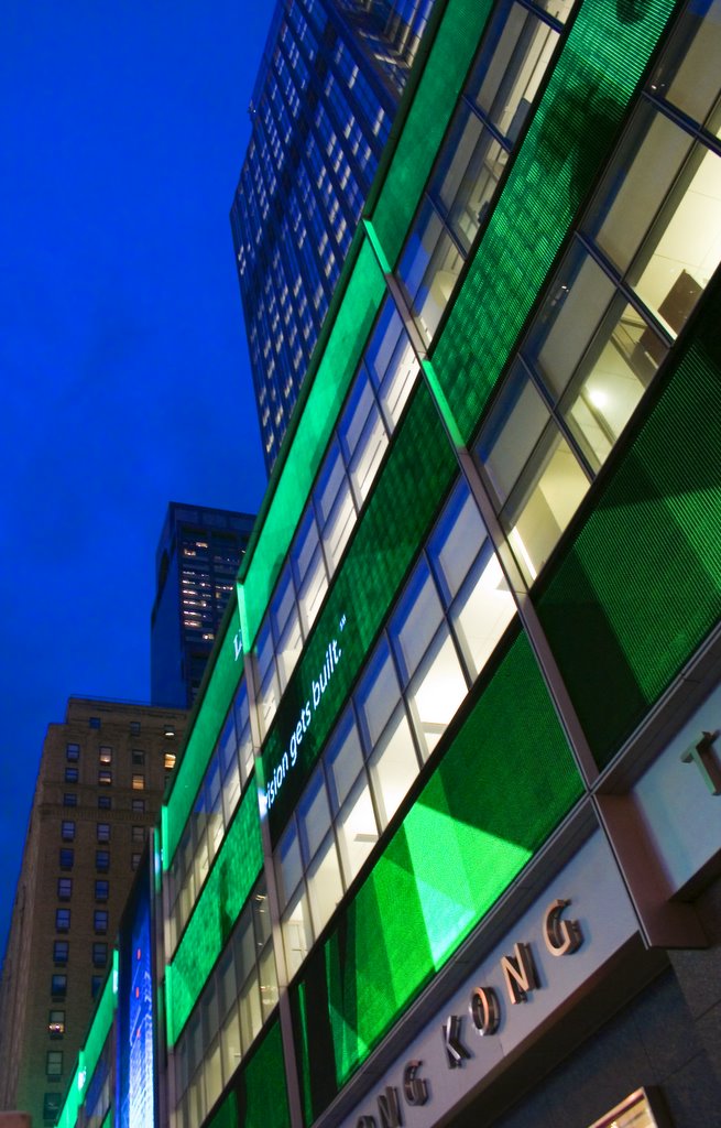
 More people walking. Some camera shake here but I still kinda like this photo.
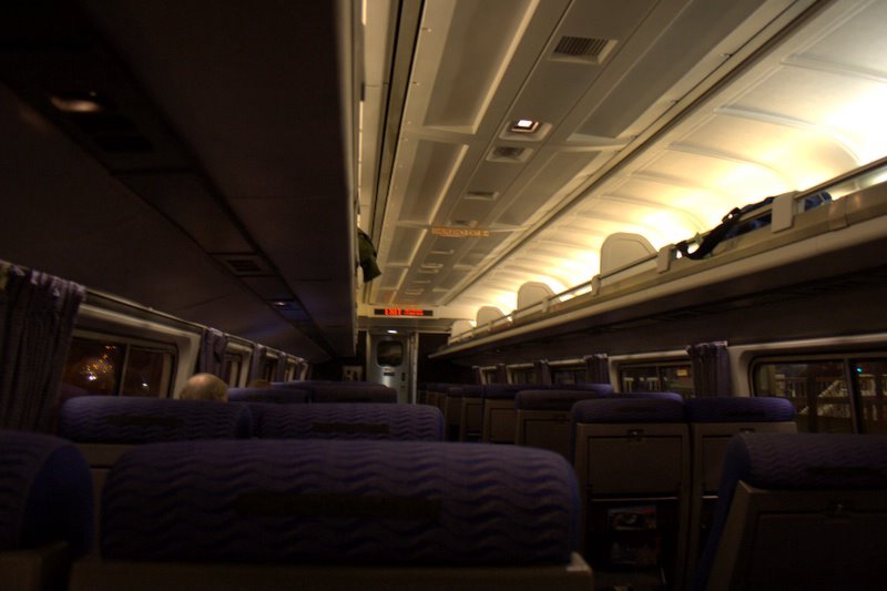
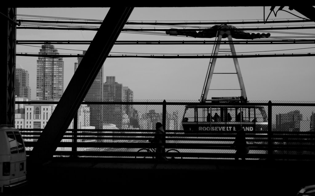
 This is not something you normally see in New York, where our subways run 24 hours a day. I hope to never see it again.